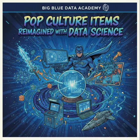
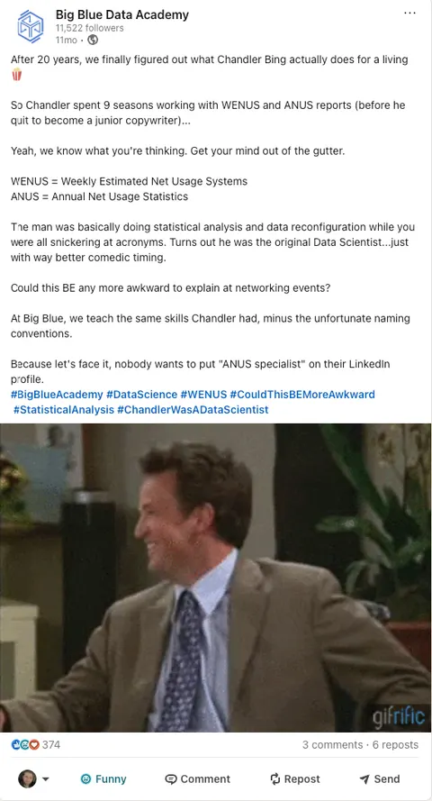
Big Blue Data Academy
The Unconventional Social Strategy That Became Mainstream
An unconventional content calendar that put pop culture next to data education and lifted the brand image with it.
Problem
Big Blue Data Academy teaches data science to career changers. The audience is on a phone, mid-scroll, and has already learned to skip anything shaped like a course advert. The ask was volume: a run of short pieces that could go out week after week and keep working, with no long approval cycle attached to any of them. I ran the social strategy and the paid media campaigns, from the brainstorm to the final cut.
Idea
I inverted the house style. Volume and sameness normally arrive together: a house style makes the second piece cheap and the fifth piece invisible, because by then the audience has learned its shape. I set the constraint the other way. Every piece had to look as if it came from a different production company, and the brand had to survive all of them.
What I made
- Promo adverts, LinkedIn and Meta posts, and ad creatives.
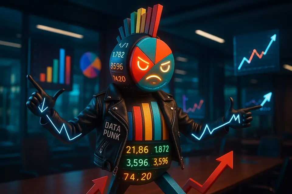
- A photoreal punk figure in a dark office, with a head made of a pie chart and a mohawk made of bars.
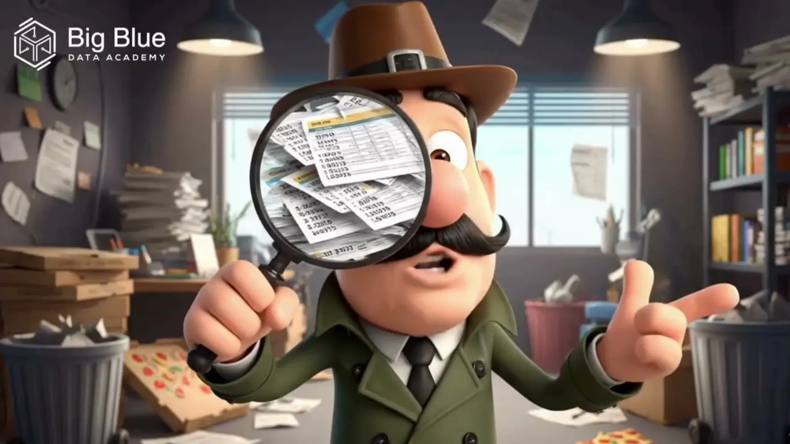
- A 3D cartoon detective in a paper-flooded room, holding a magnifier over a stack of reports.
- A country singer in a blue Stetson under a saloon sign, playing a song about data.
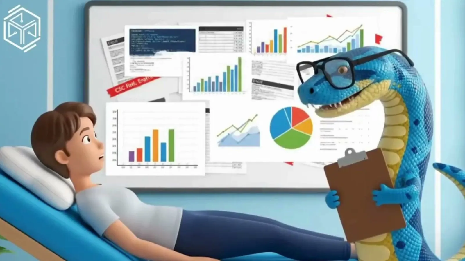
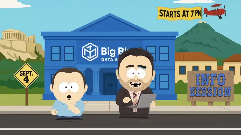
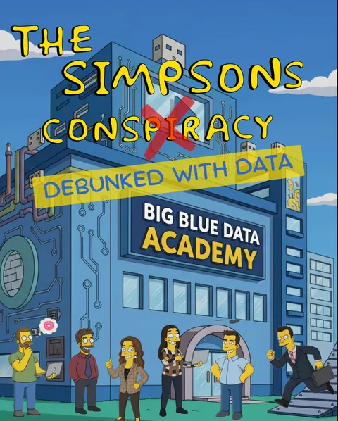
- Three more registers in the same fortnight, cut 9:16 for feed and 16:9 for wide.
Result
I delivered a run of social pieces for the school: seven registers, one brand and one fortnight. During the account period, paid-media spend fell by 60%, follower numbers grew 10% within three months and user acquisition rose 20%.
How I built it
Operator Stack is my pipeline for work where the value sits in the run across every film. I chose the registers first and wrote them down as a list before making a frame, so two briefs could not drift into the same look under deadline. A register is a decision about lighting model, edge quality and how much the world is allowed to be wrong. Each received its own plate set and prompt vocabulary. I reused nothing between them, because reuse produces the sameness this job was built to avoid.
Artefacts
- Films
- 7 pieces, 9:16 and 16:9 cuts
- Register list
- Fixed before any frame, seven entries
- Plate sets
- One per register, nothing reused between them
Gates
Gate 01
Brand gate
The mark, the blue and the lockup survive a register change without being redrawn. I composite the mark by hand: a model asked to draw a logo gets it nearly right, and nearly right on a logo is the version everybody notices.
Gate 02
Anatomy gate
I check every frame with a held object before it enters a cut. Cartoon registers fail here first: a magnifier, a guitar neck or a clipboard held by something with no thumbs.
Stack
- Register list
- Fixed before any frame
- Plates
- Nano Banana Pro, separate set per register
- Motion
- Higgsfield Cinema Studio
- Mark
- Composited in the cut, by hand
- Cut
- CapCut
- Implementation
- Google Veo 3
- Creative ideation
- Canva
Frames & films